

Website architecture is the way a site's pages are grouped, ranked, and connected. It covers four things: the page hierarchy, the navigation, the URL structure, and the internal links between pages. When it works, visitors find the right page in a few clicks and search engines can tell which pages matter most.
Most people meet architecture as a problem before they meet it as a concept. The site has grown, the menu has a More tab, three articles answer the same question slightly differently, and nobody can say where the next page should go. That's an architecture problem, and adding more content makes it worse.
The five layers of website architecture
I find it easier to think about architecture as five layers stacked on top of each other. Each one answers a different question, and a weakness in one shows up everywhere above it.
The human side of this, how people read labels and move through a journey, is what UX and information architecture covers in more depth. The search side, how hubs and links signal importance, gets its own page on SEO site architecture.
Why structure beats page count
The clearest lesson I've had came from HSAMaxGuide. Search Console started showing impressions for Zyrtec, Flonase, hand sanitizer, and a dozen other products. The obvious move was a page for each one. Then fifty more. Before long, hundreds of near-identical pages with nothing tying them together.
The better move was one hub for OTC eligibility, with the individual products connected under it and the hub connected to HSA versus FSA and the broader eligible-expenses guide. One page no longer has to carry the whole topic. The network carries it.
OTC MEDICATIONS
       │
  ┌────┼─────┐
Zyrtec Flonase Claritin
  └────┼─────┘
       │
OTC ELIGIBILITY HUB
       │
   HSA vs FSA
       │
ELIGIBLE EXPENSES
PetCareHall taught the same thing from another angle. It didn't get better by publishing more. It got better when the articles started pointing at tools, comparisons, and the next question, so each page had somewhere to send you. You can read that story in From pet blog to pet-care platform.
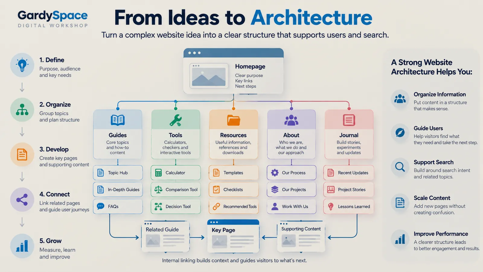
How to structure a website in five steps
This is the sequence I run on every build, new or existing. The order matters. Skipping straight to step three is how most sites end up with a menu nobody planned.
-
Define the purpose, audience, and key needs
Write down who arrives, what they're trying to do, and what a good outcome looks like for them and for you. A homeowner with a burst pipe at 11pm has ten minutes and one question. A retirement researcher has a Saturday and fifteen. Those two sites need different shapes.
-
Organize topics into groups
List every question the site should answer, then cluster them. Each cluster becomes a hub. Each hub owns one primary search intent, and closely related questions reinforce that hub instead of spawning their own pages.
-
Develop the key pages first
Build the hubs and the pages that carry the most weight before the long tail. A hub with three strong children is more useful than thirty orphaned articles waiting for a hub to exist.
-
Connect related pages
Link each page to the next question a visitor is likely to have, not just to its parent. An answer should lead to a deeper guide, a comparison, or a tool. This is where a pile of pages turns into a system.
-
Grow by measuring and adjusting
Watch what search engines and visitors actually do. Search Console queries often reveal clusters you didn't plan for. Treat that as architecture feedback: sometimes the answer is a new page, more often it's a better connection between pages you already have.
Website hierarchy: getting the tree right
Hierarchy is the parent and child relationship between pages. A healthy one is wide at the top, shallow enough to navigate, and specific at the bottom. Three rules I keep coming back to:
- One intent, one destination. If two pages would rank for the same search, merge them or give one a clearly different job.
- Important pages within about three clicks. Not a law, but a useful check. If a key page is buried, the hierarchy is telling you it's less important than you think it is.
- Hubs over folders. A hub page explains its children and links to them. A folder is just a URL prefix. Visitors can use the first. They can't use the second.
FixRN is a good example of layered hierarchy. State hubs sit above city pages. Guide hubs sit above troubleshooting pages, cost pages, and DIY versus professional guides. Each layer has a distinct job, which is what stops it from turning into a city-page machine where every URL says the same thing with a different town name.
Navigation structure
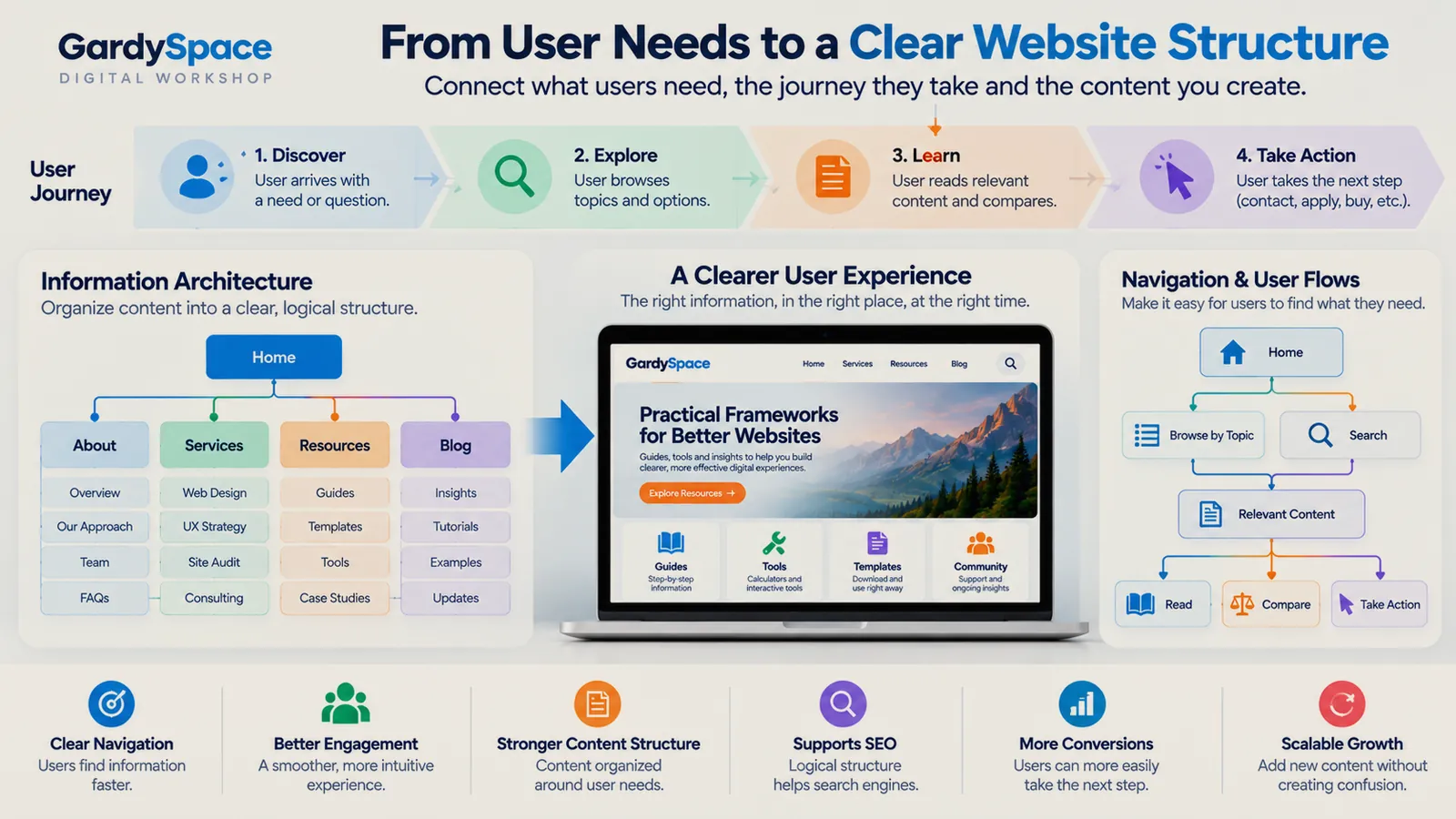
Navigation is the part of architecture visitors actually touch. The menu should reflect the hierarchy, not replace it. A few things that have held up across builds:
- Keep the primary menu short. Five to seven items. When I rebuilt this site's nav it went down to five: Start Here, Projects, Build Journal, Analysis, About. Everything else moved to the footer or into the pages themselves.
- Name items by what visitors want. Build Journal tells you what you'll find. Resources could mean anything.
- Use breadcrumbs on anything two levels deep. They show where a page sits and give a one-click way back up.
- Rely on in-page paths more than menus. Most visitors arrive from search on a deep page. The links inside that page are their real navigation.
Website architecture best practices
A short checklist I use before calling any structure finished:
Every page has one stated job and one primary search intent.
Every page ends with a logical next step, never a dead end.
URLs read like the hierarchy: /guides/otc-eligibility/, not /p?id=482.
Sitemap, robots.txt, and canonicals are checked, not assumed.
Navigation works one-handed on a phone.
There's an obvious home for the next fifty pages.
Architecture mistakes I've made
Most of what I know about structure came from getting it wrong first. These are the ones worth passing on.
A hub that pointed nowhere
NewsBeauty's news section looked complete. Seven cards, tags, citations. Every Read more button went to the same general blog post. It was a visual index without destinations. The full story.
A framework with a broken last step
TaxRefundSeed has a four-stage structure I'm still proud of. For a while, the paid product at the end had a dead checkout. Good architecture made it look finished before it was. What that taught me (publishes Oct 20).
Fixing content when the structure was broken
DryOutHub got flagged for low-value content. I wanted to write more pages. The real cause was a robots.txt problem blocking crawl access. Read the fix.
See it in real projects
Frameworks explain how the work gets done. The projects are where you can check whether it held up.
HSAMaxGuide
Turn individual HSA questions into a connected information system that helps visitors move from an answer to the next useful decision.
View the projectFIXRN
Make service information actionable instead of leaving visitors at generic articles.
View the projectPetCareHall
Turn useful information into a connected problem-solving experience.
View the projectBizCredX
Make a business-focused property easy to search, scan, and navigate.
View the projectWebsite architecture FAQ
What is website architecture?
Website architecture is the way a site's pages are grouped, ranked, and connected. It covers the page hierarchy, the navigation, the URL structure, and the internal links between pages. A good architecture lets a visitor reach the right page in a few clicks and helps search engines see which pages matter most.
Is website architecture the same as information architecture?
They overlap but aren't identical. Information architecture is about how content is organized and labeled so people understand it. Website architecture includes that, plus the technical side: URLs, templates, internal linking, and how the whole thing gets crawled. I treat information architecture as the user-facing half of website architecture.
How many clicks deep should a page be?
There's no official number, but I aim for every important page to be reachable within three clicks of the homepage. Depth matters less than clarity. A page four clicks deep inside an obvious hub is easier to find than a page two clicks deep behind a vague menu label.
Does website architecture affect SEO?
Yes. Search engines follow links to discover pages and use your structure to judge which pages are most important. Clear hubs, consistent URLs, and internal links that match how topics relate all make a site easier to crawl and understand. Structure won't rescue thin content, but weak structure can hide good content.
When should I restructure an existing website?
Usually when visitors keep landing on the wrong page, when several pages compete for the same search, when your navigation has grown a More menu, or when new content has nowhere obvious to live. Those are signs the original plan has been outgrown, not that you need more pages.
Does a small website need an architecture plan?
A five-page site needs a short one. Even then, deciding what each page is for, what the visitor should do next, and where future content will go saves a painful rebuild later. Most of my restructuring work has been on sites that grew past a plan nobody wrote down.
The whole process as a fill-in workbook: the one-sentence test, a content inventory, topic-to-hub mapping, journey maps, a final sitemap canvas, and a scored stress test. Printable and fillable PDF, $27.
Get it for $27See all five products
Sold through the IGNE Publishing shop, my business entity.
Worth thinking about
- If you had to delete half the pages on your site tomorrow, which half would you keep, and what does that say about your real hierarchy?
- Where does a visitor land most often on your site, and what does that page offer them next?
Page history
- The companion product is now available through the IGNE Publishing shop.
- First published: definition, five layers, five-step process, hierarchy, navigation, best practices, mistakes, and FAQ.
Planning a new site or untangling an old one? This is the part of a build I enjoy most: figuring out what the site is for before anything gets designed.
Work with Gardy